
Botanica: explore nature
Botanica is a mobile application designed to provide users with a seamless and interactive way to explore the botanical gardens in India. With a focus on fun and educational experiences, users can immerse themselves in the beauty of these gardens while learning about the diverse plant species they house.
Timeline
April-June 2023 (12 weeks)
My Role
-
Research
-
User Experience design
-
User Interface design
Tools Used
-
Figma
-
Adobe Photoshop
-
Mockup
-
Miro
Problem Statement
India boasts over 100 botanical gardens, each with unique beauty and offerings. However, the challenge lies in ensuring visitors fully appreciate and explore these magnificent places. Currently, visitors often lack the necessary awareness of how to navigate and make the most of their visit to botanical gardens. To bridge this gap and enhance the overall visitor experience, both the botanical gardens and visitors require a dedicated tool offering comprehensive support and guidance.
A peek into the solution
Here is a short video of the proposed mobile application design.
Now lets have a look at how I got to this solution:
Background

During an on-site research visit to a botanical garden for an architectural design project, I encountered several challenges that highlighted the need for improvements. One of the significant issues was the difficulty in navigating through the gardens due to their vast size—furthermore, insufficient information infrastructure limited users from fully exploring and experiencing the garden's beauty.
The Design Process

Understanding the User


I conducted a comprehensive series of interviews to gain deeper insights into the visitors' perspectives and experiences. Also, I went through some of the reviews users gave for different botanical gardens across India. The primary objective of these interviews was to understand the unique journey of each user as they interacted with botanical gardens, both before, during, and after their visit. By delving into their firsthand accounts, I aimed to uncover valuable insights that would inform the design and development of a user-centric solution.
The users I interviewed were classified into the following groups:
Group A
-
People who visit botanical gardens as a part of their leisure outings and have visited a garden at least one time.
-
People who live within close proximity to such gardens and visit the gardens frequently.
-
Probable visitors who are planning their visit and have not visited even once before.
Group B
-
Group B consists of enthusiasts who visit botanical gardens to learn about plant life.
-
This group includes people such as Botanists, Teachers, Plant enthusiasts etc.
The interviews were focused around the following points:
-
Pre-visit preparation done by the users to know more about the place and plan a visit.
-
Previous visit experiences and the inconveniences that they might have faced.
-
Opinion on Navigational and information-providing infrastructure.
-
Other personal feedback for the whole journey, i.e. from planning to visiting.
User Personas
Along with the user interviews I also decided to understand the journey of one person from each of the user group in detail.


Understanding Visitor's Journey
I needed to understand the visitor's journey from planning a visit to visiting the garden to identify the critical gaps in the process to make the experience more intuitive and comfortable.

What Visitor's Say
Through interviews and reviews of botanical gardens in India, it became clear that the challenges extended beyond navigation and information gaps. The key takeaways from the research are as follows:
Ticketing
01
Although the ticketing offices were easy to find, many people faced issues regarding online payment, providing exact change, and waiting times during peak visiting time.
Security
02
Due to the large geographical spread of these gardens, access to security and emergency services was difficult.
Awareness
03
Many visitors were unaware of the closed places within the premises, the general rules and do's and dont's of the garden, and the facilities available.
Information & Navigation
04
One of the most common problems faced by visitors was the lack of signages, information display boards, and Site maps for navigation.
Analyzing various approaches
Although the Indian market lacked direct competitors, I conducted a thorough review of the
US National Arboretum and the Fairchild botanic garden mobile applications to gain insights into their features and how they served their respective gardens. Here are my observations:

Upon testing these apps, it became evident that while they were able to address some of the users' concerns, they lacked comprehensiveness. These apps were specific to individual arboretums, overlooking the need for an app that covered multiple botanical gardens within a particular geographical region. The absence of such an app limited users in accessing a comprehensive and consolidated resource for exploring various botanical gardens.
Around 10 of the most visited Botanical gardens from different states in India were studied to understand the services and facilities they offered, which helped in making a common information system.
The Design Intent
Based on the learnings from the user research and competition analysis I identified the key features of the application which may cater to the users needs.
Network of gardens
01
Extensive information about the different botanical gardens across India.
Navigation & Discoverability
02
Easy to navigate maps with all necessary information and updates about the garden.
Knowledge Bank
03
On demand information & fun learning interfaces for the various plant species present in the botanical garden.
Easy Ticketing
04
Option to purchase entry tickets for the botanical garden.
Ideation
To identify the core aspects of the product, I generated ideas that directly addressed the main problems uncovered through user research. These ideas played a crucial role in selecting the most vital features that aligned with the needs of the personas. By combining these ideas, I was able to outline the key features that would be integral to the product's success.

Ideas To Sketches

Explore Page
Plant Identification (AI Scanning)
Maps & Navigation
HomePage
List of Trails
Trail Details
User Account Page
Plant Information
Site Map
Screen
Trail Map
Screen
AI Scanning
The next step was to convert these ideas to Mid fidelity mockups and test with the user.

Login Page
Select City & Garden
Explore Page
User Account
Overlay
Trail Information
Screen
Trail Information
Screen
List of Trails
Entry Ticket Booking
Plant ID
Landing Page
Plant Information
Page
Site Map
Trail Navigation
These Mid Fidelity Mockups were then tested with a group of 8 people. The learnings from this session were then incorporated into the design. Let's have a look at 5 Important changes that were made:
Usability Testing

Information Architecture

Visual Design
The app’s visual design language uses blue, green, and yellow to create a natural and positive mood. The colours are based on nature and express trust, tranquillity and happiness.
The focus was on creating a clean, bright and simple user interface that is easy and fun to use.

High Fidelity Wireframes

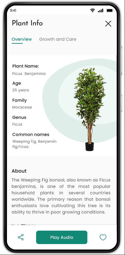
Plant Info-
Scan Result
Plant Info-
Plant Details
Plant Info-
Plant Details
Plant Info-
Plant Details
Plant Info-
Plant Details
Account-
Landing Page
OTP Screen
OTP Screen
Garden Selection
Page
Explore Page
Trail-
Info Page
Guided Tour-
Info Page
Ticket Booking-
Selection Page
Ticket Booking-
Contact Details
Explore Page-
Trails
Explore Page-
Guided Tours
Trail-
Info Page
Login Page
Ticket Booking-
Payment Method
Ticket Booking-
Payment Status
Maps-
Landing Page
Maps-
Report an isuue
Maps-
Trail List
Maps-
Trail Navigation
Maps-
Layers CTA-Overlay
Plant Info-
Landing Page
Plant Info-
AI Scanner

Account-
View your Ticket
Account-
My Plants
Account-
My Plants- Saved Plants
Account-
Settings
Conclusion
Key Takeaways
My initial project in UX design proved to be a valuable experience, providing me with crucial insights and lessons that contributed to my growth as a designer. Here are some of the key takeaways:
-
Consider the Bigger Picture:
During the app's design brainstorming phase, I learned the importance of considering the broader implications of my design decisions on the entire user base. Refining and adapting designs for the benefit of a larger user group became crucial. -
Avoid Overthinking:
Throughout the design process, I realized that I sometimes spent excessive time contemplating whether certain features or design elements would work for users, even when they were based on data and research findings. Usability testing and discussions with my mentor taught me to trust my research and instincts, and to confidently present my ideas to the users for feedback. -
Empathize with Users:
Delving into the users' journey in detail allowed me to better empathize with their problems and challenges. By understanding their perspectives, I could develop more effective problem-solving solutions that catered to their needs.
Going Forward
-
Proceed with the second phase of usability testing, and carefully analyze the feedback and reviews received.
-
Explore the potential of introducing allied features, including Bird identification, an e-commerce portal for plants, a trivia page, and more, to enhance the app's appeal to the users.
-
Consider designing cross-platform versions of the app, specifically for devices like smartwatches.